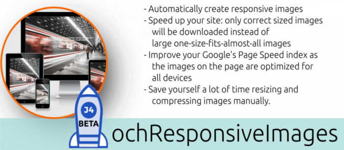
Are you struggling with 'tuning' your images on your site for best performance and Google's page speed ranking?
What looks great on a desktop is a complete bandwidth waste on mobile devices. When optimizing the image for mobile devices, how will they look on all different sizes of devices out there and how will they 'blur' on the desktop?
For each break-point an optimized image is automatically generated and cached. Your original image is replaced with an HTML srcset containing all the cached images. What will happen now is that the browser of the visitor will decide which image fits best on his/her screen and only download that specific cached image!
The following break-points / rules are default, but can be customized to even fit your 'unique' template requirements:
- min-width: 1920px,1920px
- min-width: 1366px,1366px
- min-width: 1200px,1200px
- min-width: 992px, 992px
- min-width: 768px, 768px
- min-width: 575px, 575px
- min-width: 480px, 480px
What value does this plug-in add?
The ochResponsiveImages system plugin will:
- Speed- up your site: only correct sized images will be downloaded instead of large one-size-fits-almost-all images
- Improve your Google's Page Speed index as the images on the page are optimized for all devices
- Save you a lot of time resizing and compressing images manually... over and over again!
- Convert your images to the Google's new WebP nextgen image format and serve these to browsers that already support them
Download
Login to Download - Registration is Free in BlackJoomla but you should have subscription for download - FAQ
If after login, appears Warning (The security token did not match...) please refresh page and login again
12 file a month, always free to get started! Please see Plans
Message
Before send message Please study FAQ
All of files compressed by WinRAR - use from Latest WinRAR before install
Password for all files:BlackJoomla.com


